
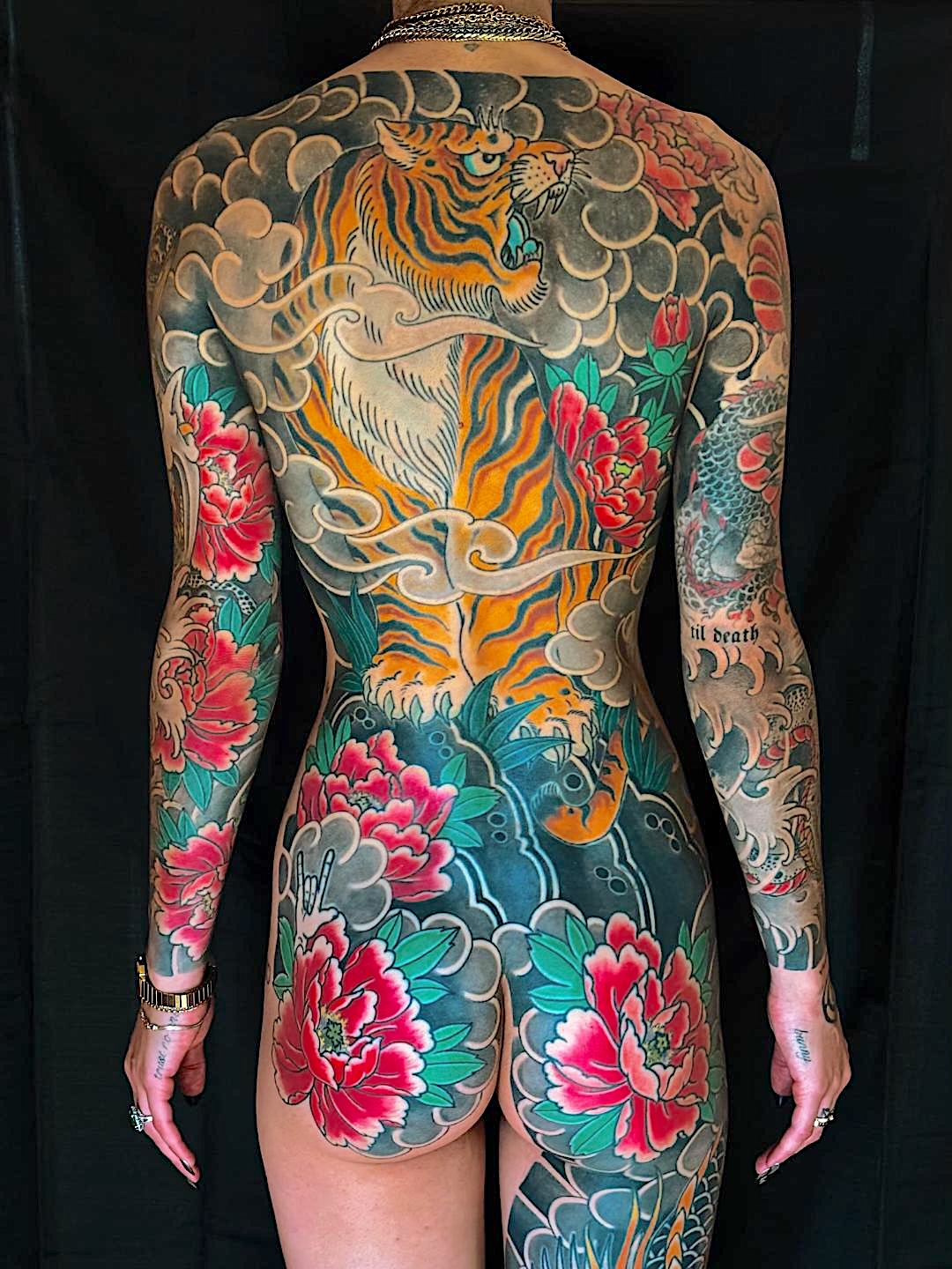
When someone comes in for a back piece, I’m looking at their body structure first. The shape, the size of their back, whether their spine and shoulders are defined, whether they have love handles. All of these physical features alter the design.
What I’m Actually Seeing When You Stand There
Here’s what I need to see:
Spine definition. If your spine is really defined, I’m not putting any key elements in the middle of the back. A warrior’s head, a dragon’s head, anything with anatomical structure, goes off to the right or left. You don’t want to put those on areas with natural curvature that will distort it and make it look anatomically incorrect.
Shoulder structure. If your shoulders are well-defined, I place key elements on the flat surface. Not where it indents.
Love handles. I avoid these for key features because of the natural curvature.
Where Everything Flows From
It’s common sense. If the head is to the right, then the body flows to the left. If the head is placed to the left, then the body flows to the right.
Usually if it’s a warrior, he’s fighting something. A dragon, an animal, another warrior. I place that image facing the face of the warrior. So if the head is to the left, then I have space on the left for the key elements of the other image, and usually it’s much lower, on the butt or upper back of the thigh.
The Waistline Is a Man-Made Line
The back, if you’re referring to ending at the waistline, that’s a man-made line. It doesn’t stop there. It continues down to the back of the thighs. In traditional Japanese tattooing, all back pieces end just above the back of the knees. Unless they’re getting a full body suit, then it ends just above the ankle bone.
Most of my clients understand this going in. For those who came in thinking about just the back, this is usually the first thing that surprises them.
I realized way back when, when I started doing large work, that you can’t fit much in the space from waist to shoulders. The balance of background and main image needs to be 80/20. Eighty percent image and twenty percent background.
Background Completes the Composition
Background is filler. It’s the frame. Think of it as a picture frame. That’s about 20%.
I use all of the above elements depending on the image. If it’s a koi, obviously then water will be a main theme for background. If I’m doing a warrior, then I usually will do clouds more above and incorporate water as it crosses the waistline and butt area to create more flow into the legs. Unless they want more land animals, then I will start incorporating the waves lower down on the legs. It really all depends on the images we’re using, and that varies from piece to piece and client to client.
All the background is black and grey, so it’s not so cut and dry. There’s no defined line where you just start a wave.
You use bars, wind, waves, and make the transition.
I’m very experienced, so I don’t do much of the background drawing anymore. I keep it in mind while I’m drawing and looking at their body structure, but I mainly draw all the background on the client, so it fits their body exactly as it should.
Why I Draw on Skin
Flat is flat. The body is three-dimensional, so there’s a lot you don’t capture on paper.
A fold, a crease, that all changes. On paper it’s just a line, but in reality it could be inches that create a fold, and you can’t determine that unless it’s in person.
Your main objective is to capture the piece in natural position. So when standing normal, it looks spot on.
The movement of the body is unpredictable, and that’s not the main objective.
What Works on Your Body
They let me do my thing. That’s why they come to me. If it’s not going to work, then I will tell them. But usually we don’t need to switch up the subject matter totally.
We might just need to reposition it, and that’s my job to figure out what will work best for their body.
80/20
Eighty percent image. Twenty percent background. You need it to be that ratio.
That’s how I plan a back piece. I look at the body structure. I place the key elements where they won’t get distorted. I let the head placement determine where the body flows. I extend the canvas to just above the knees because that’s where it actually ends. I use background to create the transition and keep the 80/20 ratio. And I draw it on the client because flat paper doesn’t show me what I need to see.
It’s not complicated. But you have to do it that way, or it doesn’t work.
Leave A Comment